Human touch in graphic design is one of the most significant design trends of 2026. For business owners, it represents a concrete decision: should my brand look like every other brand out there, or should it look like something made by a human being?
Where the Trend Toward Imperfection Came From
The answer is simpler than it might seem. When every design tool can produce a perfectly polished project in a matter of seconds, perfection stops being a differentiator. It becomes noise.
Internet users today spend several hours a day scrolling through content, an increasingly large portion of which has been generated automatically. The brain has quickly learned to recognise that pattern: symmetrical composition, perfect margins, a stock photo that fits everything and nothing in particular. That kind of communication doesn't hold attention, because there is nothing in it capable of surprising anyone.
The brands that first understood this shift began deliberately introducing irregular elements, hand-drawn illustrations, documentary photography instead of staged shoots, and typefaces with genuine character instead of neutral fonts. The effect was immediate: they stood out in a space where everything looks the same.
What Human Touch Actually Means in Graphic Design
The trend doesn't mean abandoning professionalism or returning to the aesthetics of the nineties. It means consciously introducing elements that signal the presence of a human being behind the brand.
Typography With Personality
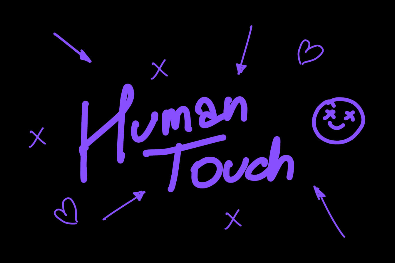
Neutral, geometric typefaces dominated design for the past decade. In 2026, brands are increasingly reaching for fonts with irregularity built into their design: faces inspired by handwriting, fonts with a distinct calligraphic character, typography that has its own personality instead of fading into the background.
This doesn't mean sacrificing readability. It means choosing a typeface that communicates something on its own, before the user reads a single word.
Illustration Instead of Stock
Stock photography has one fundamental problem: the exact same image can appear on your company's website and on the websites of ten of your competitors. A bespoke illustration doesn't have that problem, because by definition it is unique.
Brands investing in human touch are increasingly moving away from stock in favour of illustrations created specifically for them: hand-drawn sketches, graphics with an irregular line, animations that look as though they were drawn by hand. A single element like this immediately sets a brand apart and builds an association that cannot be copied simply by changing the colour palette.
Imperfection as a Deliberate Design Decision
Intentional asymmetry in a page layout. A paper texture in the background instead of a perfectly white space. Photographs that look as though they were taken on a phone rather than in a professional studio. Colours that aren't perfectly calibrated for every device.
Each of these elements sends the same signal: there is a human being behind this brand, not an algorithm. In an environment where it is becoming increasingly difficult to distinguish generated content from created content, that signal carries real value.
Why AI Accelerated This Trend
AI-powered tools did for design what digital cameras did for photography: they democratised production. Today, any company can generate a piece of graphic work in a few minutes that looks like a professional project. And that is precisely why such a project has stopped standing out.
The paradox is straightforward. The easier it becomes to produce perfectly polished design, the less that perfectly polished design is worth. Brands that understand this dynamic invest in what AI cannot generate: an authentic point of view, an individual visual style and elements that are unique because they come from a specific story and specific people.
Human touch in graphic design is not a reaction against AI. It is an answer to the question of what remains as a differentiator when content production becomes universal and cheap.
Human Touch in Practice: How to Bring It Into a Brand's Visual Identity
For a business owner considering a rebrand or a refresh of their visual identity, human touch doesn't mean revolution. Often a few deliberate decisions are enough.
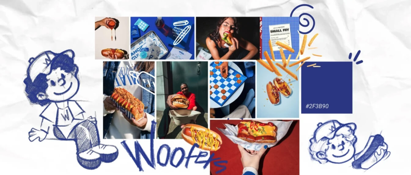
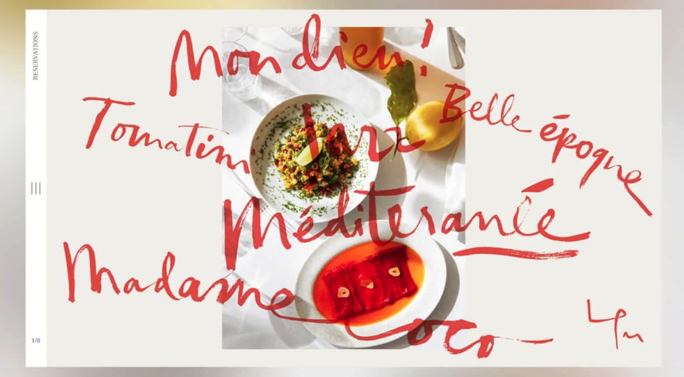
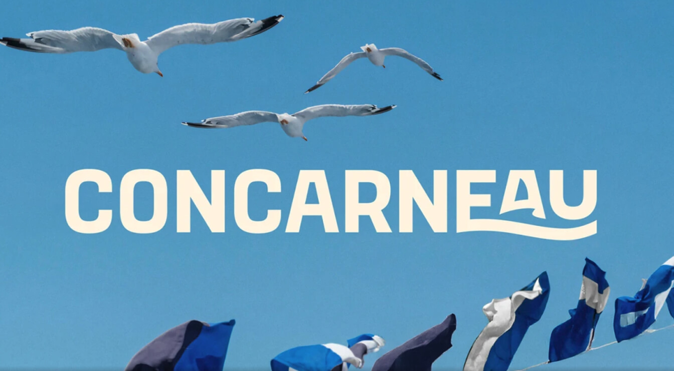
The first concerns photography. Replacing stock images with authentic photographs from within the company, featuring real employees and real spaces, shifts the perception of a brand faster than any change of colour palette. A client who sees real people builds trust differently than a client who sees an agency model.
The second concerns language. Human touch is not purely a visual trend. Brands that embrace it also shift their tone of communication: less formal, more direct, allowing personality into the conversation instead of defaulting to corporate neutrality.
The third concerns graphic elements. A single bespoke element, an illustration, a hand-drawn line, a distinctive texture, is enough to make a brand start standing out in a space where everyone is using the same tools and the same templates.
Who This Trend Works For and Who Should Approach It With Care
Human touch works particularly well for service-based brands where trust and relationship are central to the purchasing decision. Agencies, studios, consultancies, local businesses, craft producers. In each of these cases, an authentic visual identity directly increases the likelihood that a potential client will reach out.
For large corporations operating in regulated industries, banking, pharmaceuticals, public institutions, this trend requires a more considered approach. Not because human touch is impossible there, but because it needs to be balanced against the need to communicate stability and professionalism in a way that resonates with a specific audience.
The line between authenticity and visual chaos is narrow. A well-executed project with human touch elements looks like a deliberate decision, not a lack of consistency. That difference requires design experience, not just an awareness of the trend.
Frequently Asked Questions About Human Touch in Design
Does human touch mean giving up professionalism?
No. It means redefining what professionalism communicates. A brand can be both authentic and competent. In many cases, authenticity is the strongest evidence of competence, because it shows that the company is not hiding behind corporate language and generic visuals.
How do you balance authenticity with the need for brand consistency?
Consistency doesn't mean every element being identical. It means every element communicating the same character. A brand built on hand-drawn illustrations, irregular typography and authentic photography can be just as consistent as a brand built on clean geometry, provided all those elements follow from a single, considered direction.
Is this a short-term trend?
Human touch as a response to the dominance of AI and generic aesthetics has foundations that won't disappear with a change of season in the design industry. As long as tools for automated content production continue to develop, authenticity will continue to gain value. The specific forms in which this trend expresses itself will change. The underlying direction will remain relevant.
Summary
In 2026, perfection is no longer enough. Brands that understand this shift invest in what cannot be generated: authentic character, a distinctive visual style and communication that has a human being behind it, not a template.
If your brand looks like every other brand in your industry and you're wondering what to do about it, let's talk. I'll show you how to bring authenticity into your visual identity without losing consistency or professionalism.

.jpg)